The consortium had multiple partners, one patient journey, and no shared identity. The brand had to work at the moment a family is already in crisis, often a child with complex physical and developmental needs, unifying the organizations without losing a human tone.
The brand needed to make the care model visible: family at the centre, partner agencies connected around them, and progress shared across the consortium. The direction was to create a simple, human identity that staff could use consistently and families could trust during a crisis.
The icon puts the family at the centre, with partner connections around them. I kept the mark simple so it would stay recognizable across partners, instead of trying to explain the whole care model in one symbol. Color and form moved away from a typical clinical look, warmer tones, soft gradients, rounded shapes, so it would feel human, but still hold up in decision-making materials.

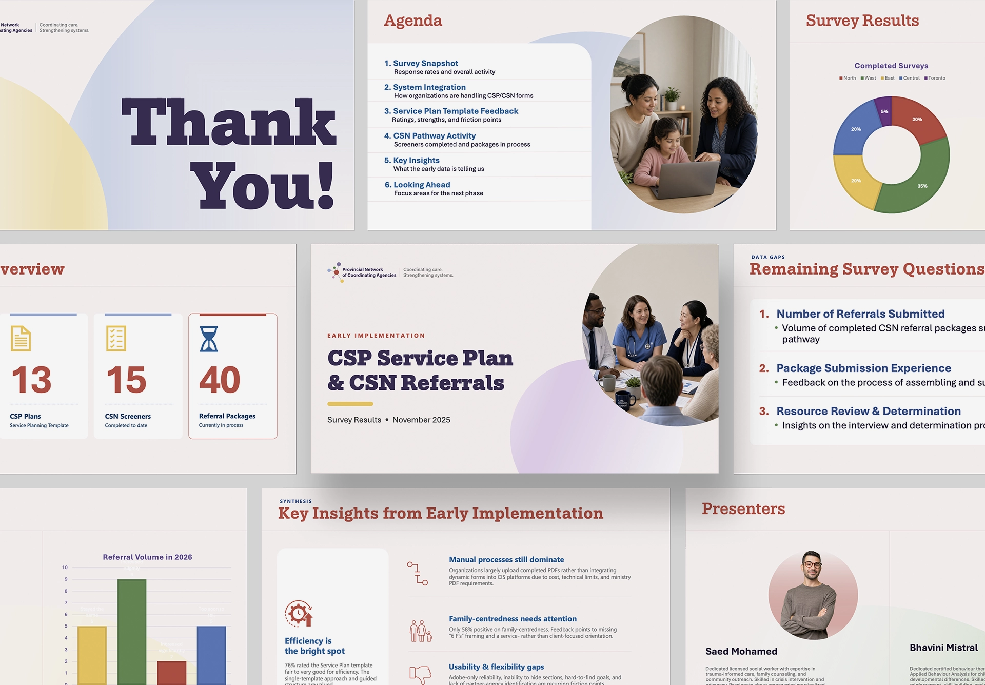
The consortium now has one recognizable identity instead of a collection of partner materials. The brand holds together across logo, brochure, and presentations — clear enough for staff to use, and human enough for families at the point of crisis.